The data set below is based on the presidential election during 2016, where it outlined the name of the candidate, the source of the poll (ABC vs, CBS). Discuss your result in your blog:
> Name <- c(“Jeb”, “Donald”, “Ted”, “Marco” “Carly”, “Hillary”, “Berine”)
> CBS political poll results <- c(12, 75, 43, 19, 1, 21, 19)
This code creates three vectors, Name, ABC_political_poll_results, and CBS_political_poll_results and stores 7 elements in each vector. Name consists of character elements and ABC and CBS consist of numeric elements.
Based on the topic of this module, I also added the a line of code that compiles these vectors into a dataframe I called poll_results. I used the base R function data.frame() to achieve this, listing each of the previously name vectors as arguments.
Below my code screenshot is a screenshot of my poll_results dataframe. As you can see, each of the 3 vectors are now the three columns of my dataframe, ordered in the order that I listed them in my data.frame() function
Matloff Chapter 3-5 Things I leared:
A R List is similar to a python dictionary: Nothing has made R lists make more sense to me that this phrase haha
Recursive lists = lists within lists, nested lists
data frames differ from matrices in the sense that each column has a different data objects. Ex: One column can have strings, one can have integers
This is a super fun cheat sheet! I had a version of this for SQL and it was so helpful! I’m glad to have found a version for R – this is definitely going in my file depository. Even better, its for TidyVerse! Which is my library of choice for R 🙂
2.Chapters 1-3 from Matloff, Wickham Chapter 13 Things I learned:
Matrices facilitate linear algebra calculations
Images count as a matrix – I hadn’t thought about it like that before, but in retrospect that makes a lot of sense
You can read image matrices in R using a library called pixmap – very cool
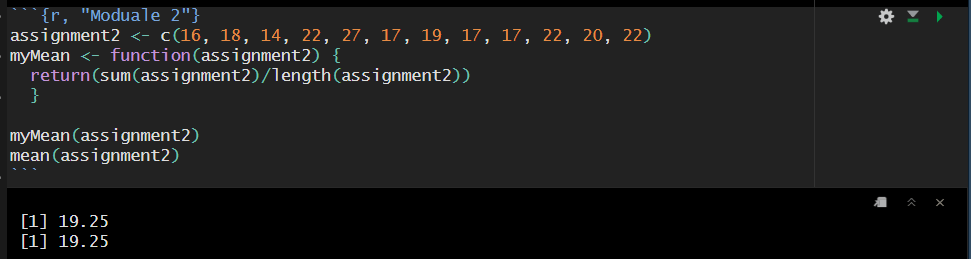
3. Your assignment, evaluate the following function call myMean. The data for this function called assignment.
This function is working as intended. How it works is that the custom function myMean() takes the vector, assignment2, as an argument. Technically, the argument did not need to be named assignment2, it could have been named x, vector, potato, so long as the function moving forward used that same name.
Then, the function takes the sum of the vector (adding up each value) and divides it by the length of the vector (how many elements are in the vector). Double checking our custom function against the base r function mean(), we can see that both of these functions are returning the same value.
Here is a link to the github page where you can find my rmd file: here
2.R-Programming Blog I am repurposing my Blog from ADV stats for this class, as I already own the domain, and so I can reference past Stats work easily. Unfortunately I cannot change the domain, but I did change the blog title to reflect its multiuse now https://hagenadvstats.blog/
3.Install R Studio R Studio is successfully installed 🙂
4.Ratloff Chapters 1-2 (what is vector etc) and Wickham 1-2
Things I learned:
That you can use R without RStudio, and that RStudio functions as a GUI. Also, that other GUI programs exist (Technically IDEs).
You can run R by just clicking on the R icon – this opens a window. Very Cool! I hadn’t know you could run R without a IDE/GUI.
Batch R is also interesting! Another thing I wasn’t aware R could do
R allows you to abbreviate True and False as T and F
You can create vectors by simply typing #:# into the console. This is how the line for(i in length:(n)) {} works!
?Syntax will give you operator precedence lists for R
the devtools package assists in package development
I’ve always wondered how you go about making packages! The Wickham Guide is such a fantastic roadmap!
For this project, I would like to look at how storytelling style (MotW vs Plot-Driven), release schedules, and episode types (e.g., season premieres, mid-season climaxes, finales) influence the success of episodically released TV shows using a dataset of episode data from the CW TV show Supernatural. By analyzing this long-running episodic series, I hope to uncover insights and offer recommendations to prospective show creators and production managers looking to create new episodic TV shows.
My analysis revealed several key findings: Plot-driven episodes consistently outperformed Monster-of-the-Week (MotW) episodes in audience ratings, highlighting the importance of engaging, overarching narratives. Season finales, which often deliver climactic resolutions, emerged as the highest-rated episode type, demonstrating that audiences value definitive and impactful conclusions. While release scheduling, including the time between episodes, showed no significant impact on audience reception or retention, my analysis found that long-running series face a gradual decline in ratings for plot-driven episodes, underscoring the challenge of sustaining narrative quality over time.
These results suggest that creators should focus on developing strong, concise storylines with clear resolutions and avoid overextending the length of a series. Prioritizing storytelling quality over strict adherence to release schedules will likely resonate more with audiences, as viewers are willing to wait for content they find compelling and well-crafted. These insights provide practical recommendations for crafting new episodic TV shows that maintain both audience engagement and critical acclaim.
The Case: Why Supernatural Supernatural, a long-running CW series (2005–2020), is an ideal case study for episodic television. Spanning 15 seasons, the show follows Sam and Dean Winchester as they battle supernatural forces, evolving from a Monster-of-the-Week (MotW) format with self-contained episodes to a plot-driven drama focusing on overarching narratives and personal struggles. Alongside its storytelling evolution, Supernatural experimented with release schedules, alternating between consistent weekly airings and irregular gaps. These varied strategies, applied to the same core story and characters, allow for a controlled analysis of their impact on audience reception, offering valuable insights into how storytelling structure and release timing influence the success of episodic productions.
Step 1: The Dataset The Dataset for this analysis was sourced from IMDb, the Internet Movie Database, and consists of 327 observations and 15 variables:
episode_id: The overall number of the episode (1–327).
episode_position: The episode’s position within its season (1–16/20/22/23).
season_number: The season to which the episode belongs.
episode_title: The title of the episode.
director: The name of the episode’s director.
writer: The writer(s) of the episode.
air_date: The date the episode aired on The CW.
days_between_episodes: How many days passed between episodes (aggregated variable).
views_at_air_mil: How many people (in millions) watched the episode on its air date.
imdb_rating: The IMDb rating of the episode.
mow_filler: Whether the episode was a Monster-of-the-Week-style episode or filler (Boolean logic).
episode_genre: The episode’s primary genre and subgenre (when applicable).
centric_characters: Which main characters were central to the episode.
s_d_solo_episode: Whether the episode was a Sam-and-Dean solo episode (Boolean logic; aggregated variable).
episode_description: The episode’s description as listed on IMDb.
To begin my project, I started with loading any necessary libraries I would need to conduct my analysis, load in my dataset into R, and do any basic cleaning needed to work with the data (which primarily consisted of removing rows filled with NA values and ensure the data column in this dataset was being read as a date data type by R).
During this portion, I also went ahead and created a simple function that would print out whether I would need to reject my null hypotheses or fail to reject them based on a set significance level. For this project, I decided to use a 5% significance level across all my hypotheses tests.
############################
Sub-Section 1: One-off or Ongoing?
Step 2 and 3: Creating and Testing my hypothesis
Problem Description: Do IMDb episode ratings significantly differ based on the storytelling structure (MotW vs Plot-Driven)?
Hypothesis:
H0 : There is no significant difference in ratings between MotW and Plot-Driven episodes.
H1 : There is significant difference in ratings between MotW and Plot-Driven episodes.
Insight to be Gained: Determine whether storytelling style influences episode reception. By identifying whether audiences prefer plot-driven episodes or self-contained MotW episodes, show creators can better align their content with audience preferences
Analysis Technique: Two sample t-test, Linear Regression
To Begin this analysis, I divided my dataset into two sub datasets based on if the episode was considered a MotW episode or Plot Driven episode.
Through this process, I found out that Supernatural had 139 MotW Episodes and 188 Plot-Driven Episodes. Because there are 2 samples, and the data is not in pairs, I determined I would need to conduct a 2 sample T-test to determine if the average rating of these two groups is statistically different.
With that conclusion, I became curious on the impact of the progression of a show and the rating of each type of episode. I decided to build a Linear model to assess how/if the episode number and season number affected ratings of MotW and Plot -driven episodes
While the average IMDb rating of MotW episodes was not found to be significantly impacted by episode number overall nor season number, plot driven episodes were found to have a statistically significant negative relationship with total episodes number overall and season count, so has the show continues running, the ratings for plot driven episodes is going to slowly but consistently go down, while MotW episodes stay relatively consistent over a shows run time
My final question spurred by this topic was if the percentage of motv episodes in a seasons had a statistically significant impact on the overall season average. To study this, i am going to return to my spn dataset, calculate the average rating per season, the percentage of motw episodes per season, and see what that tells me.
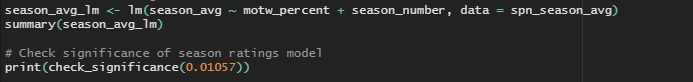
To answer that final question, I first needed to calculate the average rating per season and the percentage of MotW episodes in each season. Then, I built a linear model to assess if the percentage of MotW episodes and season number affected the overall season rating
Step 4: Summary of Results and Visualization With these hypotheses tests, I came to the following conclusions about the impact of storytelling style on IMDb episode ratings:
The average IMDb rating of MotW episodes is significantly lower than that of Plot-Driven episodes.
The ratings of MotW episodes are not significantly affected by the episode number or season number.
The ratings of Plot-Driven episodes are significantly influenced by episode number and season number (ratings decrease with progression).
The overall average season rating is significantly impacted by the percentage of MotW episodes and season number. As the season number increases and the percentage of MotW episodes increases, the average season rating tends to decrease.
I created this visualization to help showcase the difference between storytelling styles and IMDb ratings
Related Work: This subsection is strongly related to the topics and methods we learned in Module 6 (One way and Two way Sample Tests) and Module 7 (Multiple Regression). Two Sample T Tests are primarily used to “Decide if the population means for two different groups are equal or not”, which was vital in this subsection, as this helped me determine if audiences responded to these two writing styles in statistically significant different ways. Meanwhile, the multiple regression methods from module 7 helped me how the progression of a shows season count and its percentage of MotW content influenced overall season ratings. This level of analysis, which accounts for multiple predictors, provided a deeper understanding of the data and revealed patterns that would not have been apparent through simple visualizations or single-variable regression.
############################
Sub-Section 2: Go out with a Bang?
Step 2 and 3: Creating and Testing my hypothesis
Problem Description: Does the position of an episode significantly impact it’s IMDb ratings?
Hypothesis:
H0 : The position of an episode (premiere, midpoint, last half, season finale) has no significant impact on its IMDb rating.
H1 : The position of an episode significantly impacts its IMDb rating.
Insights to be gained: Determine whether the timing of an episode within a season (e.g., premiere, midpoint, last half, or finale) affects audience reception of it. Understanding this relationship can help show creators and producers in planning the structure of a season and help determine how to best utilize production budgets (such as spending less poorly received episode positions or more on season premires or finales)
Analysis Technique: ANOVA and Tukey HSD
To begin this analysis, I needed to aggregate my dataset to recategorize the episode_position variable as a categorical factor, as not all seasons of the show were the same length. For this analysis, I wanted to look at the type of episode each position represented, rather than the literal numeric episode_position.
With this aggregation, the episode_position variable has been recategorized into 1 of 5 different groups, making it perfect for an ANOVA analysis which works best when there are more than 2 distinct groups.
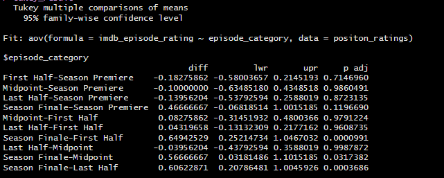
Because this model was found to be significant, I wanted to know which episode_position category performed the best of the five different options, so I decided to run a Tukey’s HSD test.
Step 4: Summary of Results and Visualization
With the results of these tests, I came to the following conclusions about the impact of episode position on overal season IMDb ratings:
Season Finales tend to have significantly higher IMDb ratings compared to the other categories (First Half, Midpoint, and Last Half).
There is no significant difference in ratings between other episode position categories
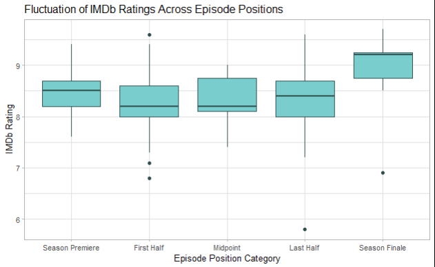
I created the following boxplot to visualize the fluctuation of IMDb ratings across episode positions, as well as identify outliers in episode position categories
Related Work: This subsection strongly related to the topics and methods we learned in Module 8 (ANOVA). ANOVA tests are used when comparing the average scores across 2 or more variables or categories. The techniques I used in this assignment greatly resembled the first question of Assignment #8, where we needed to look at the average scores across multiple categories of stress levels. However, instead of 3 stress categories, I looked at the difference of means across 5 different episode categories. This allowed me to investigate whether variations in scheduling impacted audience reception, providing a practical application of the concepts learned in the module.
############################
Sub-Section 3: Timing is Everything
Step 2 and 3: Creating and Testing my hypothesis
Problem Description: Do episodes with shorter gaps between air dates have higher viewership / IMDb ratings
Hypothesis:
H0 : The time between episodes does not have impact on audience viewership and/or rating
H1 : The time between episodes does have impact on audience viewership and/or rating
Insight to be Gained: Determines the impact of release scheduling on audience retention and reception. Understanding whether shorter or longer gaps between episodes improve reception can help optimize episodic release strategies.
Analysis Techniques: Descriptive Analysis (Measures of Central Tendency), ANOVA
To begin this analysis, I needed to aggregate my dataset to recategorize the days_between_episodes variable as a categorical factor.
Using this categorical factor, I calculated the following descriptive statistics to get a feel for the data and identify any obvious trends. I decided to look at both Mean and Median to account for any outliers.
At a glance, it did not seem like there was much fluctuation between the measures of central tendency across different time categories. However, to confirm this observation, I decided to move forward and conduct a hypothesis test anyways.
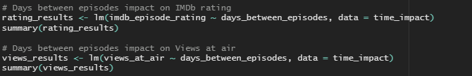
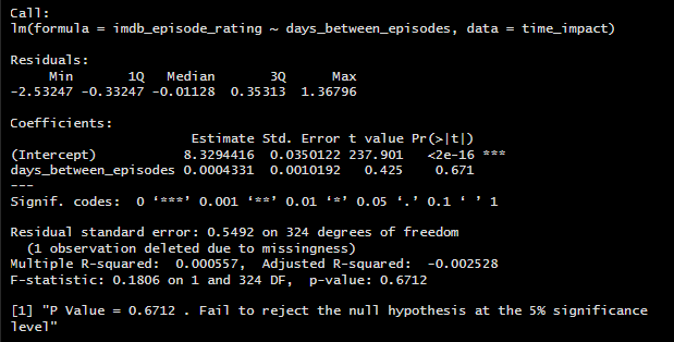
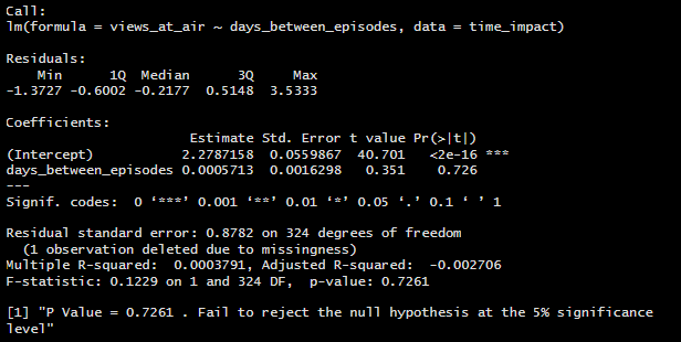
In this situation, I had the option to either run an ANOVA to test if the categorical factors categories have a significant impact on my response variable or build a linear regression model to test if the numeric days between episodes have a significant impact on the response variables. I chose to do a Linear Regression analysis because utilizing my numeric days variable over my grouped categorical factor would give me more precise answer to my question rather than an ANOVA group analysis. Plus, If this model proved significant, I would be able to see the impact of each additional day between episodes on IMDb rating, rather than giving show creators and producers a window of time.
Step 4: Summary of Results and Visualization
The Linear Regression model confirmed my earlier observations, and I came to the following conclusion on the impact of days_between_episodes on IMDb ratings and Views:
Time between episodes does not have a significant impact on audience perception of episode quality (episode ratings) or viewer retention
I created the following visualizations to showcase the both the change in IMDb rating and Views at air over the course of the show’s runtime, as well as the fluctuation (or rather, lack of fluctuation) of these variables across the categorical time factors.
Related Work: This subsection strongly related to the topics and methods we learned in Module 3 (Descriptive Statistics and Measures of Central Tendency) and Module 7 (Single Regression). While descriptive statistics are relatively basic measures, sometimes nothing can beat their sheer effectiveness of giving quick insights into complicated data patterns. Even before I ran my hypothesis test, I already had an inkling that the test would not prove significant simply based on this data’s measures of central tendency. By building and analyzing a single linear regression model, I was able to confirm these initial observations quantitatively, testing the relationships between my response variables (IMDb rating and Views) and verifying the limited influence of Days between Episodes. Together, these two, albeit simple statistical methods, demonstrated how a combination of descriptive and inferential techniques can provide both quick and robust insights of trends.
############################
Step 5: Project Conclusions and Final Recommendations
The findings of my analysis suggest that audiences prefer plot-driven episodes with concise, definitive conclusions. Plot-driven episodes consistently received higher ratings than MotW episodes, and season finales, the episodes that often deliver climactic conclusions, were rated the highest overall.
However, maintaining the quality of plot-driven episodes is critical, as their ratings tended to decline over time, particularly in later seasons. This indicates that while audiences value overarching narratives, the length of a series will eventually outpace even the best plot and audiences may lose interest if a show continues too long past its prime.
Interestingly, the time between episodes had no significant impact on audience perception of quality or viewer retention. This imples the idea that a well-crafted show can maintain its audience even with irregular release schedules and that viewers are willing to wait for episodes if they believe in the quality of the show.
To summarize, I recommend that prospective show creators and production managers:
Focus on crafting strong, engaging, and concise plot-driven narratives.
Ensure seasons have clear, compelling climaxes, particularly in season finales.
Prioritize maintaining quality over long-term runs to sustain viewer interest.
Avoid overemphasizing the importance of consistent release schedules: audiences care more about substance than timing.
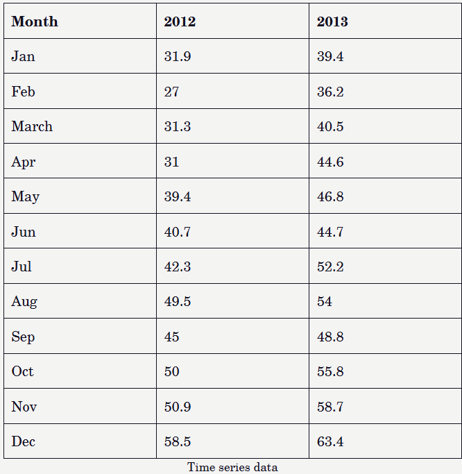
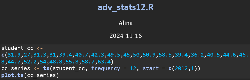
This code imports the data, transforms it into a time-series object, and generates a plot to visualize the changes in values over a 24-month period, spanning from January 2012 to December 2013.
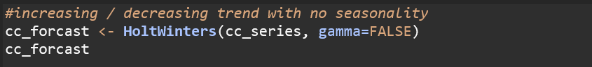
This chart shows a general upward trend throughout the year, followed by a drop at the start of the next. However, due to the limited duration of the dataset, this does not necessarily indicate seasonality. Seasonality refers to recurring patterns observed consistently over multiple cycles, such as daily, monthly, or yearly intervals. Because we can only see two cycles in this data, we cannot assume seasonality. Since we are assuming that the data lacks clear seasonality, we will use Holt-Winter’s exponential smoothing technique with the seasonality parameter (gamma) set to False.
Smoothing parameters: Alpha = This is the smoothing parameter for the level. A high alpha (closer to 1) indicates that the model gives more weight to recent observations when updating the level. Beta = A lower beta value suggests that the trend is smoothed more slowly compared to the level, making it less sensitive to fluctuations in the trend over time. Gamma = Indicates that seasonal smoothing is turned off, meaning the model does not include a seasonal component.
Coefficients a: This represents the smoothed estimate of the level (the overall “baseline” value of the time series). b: This represents the smoothed estimate of the trend (the rate of change over time). It indicates that, on average, the values are increasing by approximately 2.43 units per time period.
This chart demonstrates the results of Holt-Winters exponential smoothing, with the black line representing the observed (actual) values of the time series, and the red line representing the fitted (smoothed) values from the model.
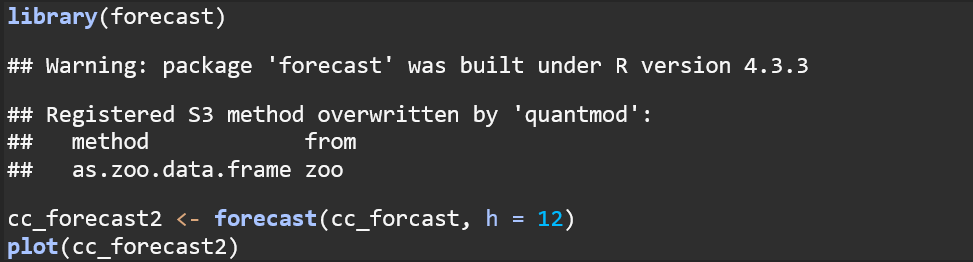
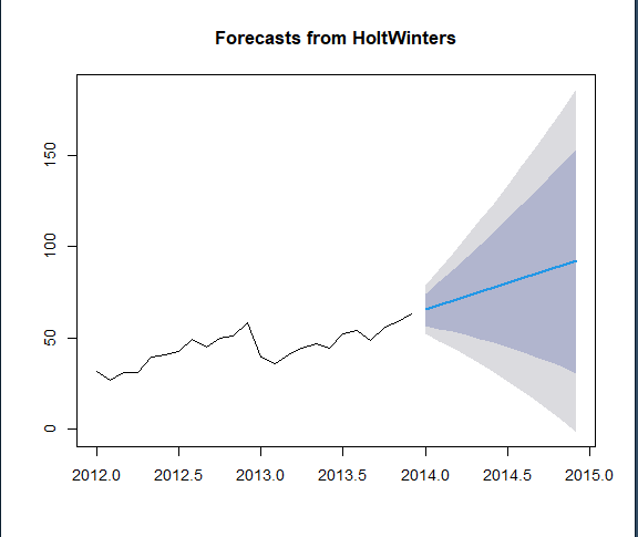
This plot displays the results of forecasting using the Holt-Winters model for the next 12 time periods. The black line represents the historical observed data, while the blue line and shaded areas represent the forecast and confidence intervals, with 80% prediction intervals shown in the dark blue section, and 95% prediction intervals shown in the light grey.
Discussion on Time Series Models The results of the Exponential Smoothing Model using Holt-Winters effectively captured the upward trend in the time series data while smoothing out short-term fluctuations. The fitted values closely aligned with the observed data, providing a clear representation of the underlying trend. The sharp dip in 2013 is assumed to be an anomaly, as we lack sufficient data to determine if it reflects a recurring seasonal trend. While it is possible that a similar dip could occur at the beginning of 2014, there is currently no evidence to support this pattern. Thus, we proceed under the assumption that this dip is an anomaly until additional intervals provide further clarification.
Time series analysis is invaluable for tracking changes in variables over fixed intervals across a duration of time. The Holt-Winters smoothing technique and the forecast library in R can help predict future values by emphasizing recent observations, incorporating trends, and accounting for potential seasonality. Forecasting models offer significant advantages over standard linear or polynomial regression when working with time series data. One key strength of forecasting models is their ability to capture temporal dynamics, recognizing that recent observations often have a stronger influence on future values than older data. Standard regression, by contrast, assumes independence between observations, which is often unrealistic in time series contexts.
The code essentially sets up an additive model to analyze the effect of the treatment (treat), the period of administration (period), and individual differences between subjects (subject) on the VAS scores. The attach() function allows us to reference ashina column names without specifying ashina$ each time. This additive model is designed to capture the effects of the treatment, period, and subject (individual differences) on the VAS score.
(Intercept): This is the baseline level (subject 1) when treat and period are set to their baseline levels. The estimate of -113.06 suggests a VAS score starting point (when all factors are at baseline) and is significantly different from zero (Pr(>|t|) < 0.001). Subject Coefficients (subject2, subject3, etc.): These represent the difference in VAS score for each subject relative to the baseline subject (subject1). For instance:
subject2 has a coefficient of 51.50, indicating that their VAS score is expected to be 51.50 higher than the baseline (subject1) after controlling for other factors. However, this estimate is not statistically significant (Pr(>|t|) = 0.190721).
Significant values have stars (e.g., subject3, subject4, etc.), indicating that these subjects’ VAS scores are significantly different from the baseline.
Treat: The treatment effect shows that moving from the placebo (coded as 0) to the active treatment (coded as 1) decreases the VAS score by -42.87. This effect is statistically significant (Pr(>|t|) = 0.005491), meaning the active treatment is likely effective in reducing the VAS score compared to placebo. Period: This coefficient has NA for its estimate, standard error, t-value, and p-value. This suggests singularity, which occurs when there is perfect multicollinearity—meaning one or more predictor variables can be exactly predicted from others in the model. Here, period is likely collinear with other factors (like subject or treat), so it cannot be estimated separately. This often happens in repeated measures data where the model is over-specified.
Model Summary: Residual standard error: This is the average distance that the observed VAS scores fall from the model’s predicted scores. Multiple R-squared (0.7566): This indicates that approximately 75.66% of the variance in VAS scores is explained by the model. Adjusted R-squared (0.4969): This adjusts for the number of predictors in the model. Here, it’s quite a bit lower, indicating that some predictors may not be adding substantial explanatory power. F-statistic and p-value: The F-test evaluates the overall significance of the model. A p-value of 0.02229 indicates that, overall, the model fits the data better than a model with no predictors.
T-value: This is the calculated t-statistic, which measures the difference between the means relative to the variability in the data. A larger absolute t-value indicates a larger difference between the two groups. P-value: A p-value of 0.005644 suggests that this difference is statistically significant at the 0.05 level (and even at the 0.01 level), meaning we reject the null hypothesis that there is no difference between the two treatments. Confidence Interval: This confidence interval shows the range within which the true mean difference is likely to fall 95% of the time. Since both bounds of the interval are negative, this further indicates that the active treatment is associated with a reduction in VAS scores compared to the placebo. Mean Difference: The mean difference between vas.active and vas.plac is -42.875. This aligns with the treatment effect in the linear model output, where the coefficient for treat was also around -42.87, indicating consistency between the two analyses.
Comparison between the t.tests and lm() models: The paired t-test provides a direct comparison between the active and placebo treatments, while the additive model (from lm) also considers individual subject differences and the period of treatment. Both methods show a similar treatment effect, but the additive model gives additional insights by accounting for these extra factors.
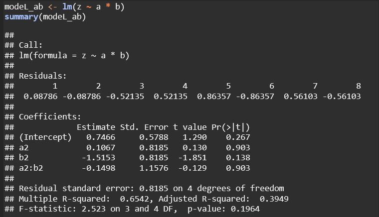
These matrices show how each term (main effects and interaction) is represented in the design matrix for the respective model. The difference between ~ a * b and ~ a : b lies in which terms are included in the model:
~ a * b
This shorthand expands to ~ a + b + a:b.
It includes:
Main effects for both a and b (individual contributions of a and b to the response variable).
Interaction effect a:b (the combined effect of specific levels of a and b).
This formulation is useful when you want to assess both the independent effects of each factor and how they interact with each other.
~ a : b
This includes only the interaction term a:b.
It does not include main effects for a or b individually.
This model assumes that the effect of a and b on the response variable exists only through their interaction. It does not model the individual effects of a and b separately.
Model z ~ a * b: This is a more comprehensive model, including both main effects and interaction terms. It avoids singularities and allows for independent interpretation of each factor and their combined effects. Although none of the terms are statistically significant here, the model structure is more flexible and interpretable.
Model z ~ a : b: This model only includes the interaction between a and b without main effects, which led to a singularity (NA for a2:b2). It’s less robust and restricts interpretation, making it harder to assess the individual contributions of a and b.
This is from the Multiple Linear Regression chapter 11 of “Introductory Statistics with R”, pg. 185-194
I revised this question, so please follow my description only. Conduct ANOVA (analysis of variance) and Regression coefficients to the data from cystfibr : data (” cystfibr “) database. Note that the dataset is part of the ISwR package in R.
You can choose any variable you like. in your report, you need to state the result of Coefficients (intercept) to any variables you like both under ANOVA and multivariate analysis. I am specifically looking at your interpretation of R results.
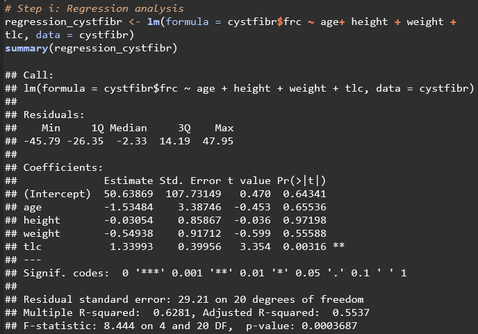
Extra clue: The model code: i. lm(formula = cystfiber$spemax ~ age + weight + bmp + fev1, data=cystfiber) ii. anova(lm(cystfibr$spemax ~ age + weight + bmp + fev1, data=cystfiber))
Interpretation of Regression Output:
INTERCEPT 50.63869 is the expected value of frc when all other predictors are 0
AGE For every value that age increases (For every additional year in age), frc is expected to decrease by 1.53484 The P-value for this variable (0.65536) is not significant at any level Conclusion: Age does not have a significant effect on frc according to this linear regression model
HEIGHT For every value that height increases (For every additional cm), frc is expected to decrease by 0.03054 The P-Value for this variable (0.97198) is not significant at any level Conclusion: Height does not have a significant effect on frc according to this linear regression model
WEIGHT For every value that weight increases (For every additional kg), frc is expected to decrease by 0.54938 The P-Value for this variable (0.55588) is not significant at any level Conclusion: Weight does not have a significant effect on frc according to this linear regression model
TLC For every unit that tlc increases, frc is expected to increase by 1.33993 The P-Value for this variable (0.00316) is significant at the 0.01 level Conclusion: tlc does have a significant effect on frc according to this linear regression model
Residual Standard Error: the average value of frc falls 29.21 values away from the regression line Multiple R Squared: 62.81% of the variation of frc can be explained by these predictors Adjusted R Squared: 0.5537, which accounts for the number of predictors in the model F-statistic: 8.444 on 4 and 20 degrees of freedom, with a p-value of 0.0003687, indicating that the model as a whole is statistically significant at the highest level (0.001)
According to the Regression Results: the only significant predictor of this model is tlc with a positive coefficient, indicating that higher total lung capacity is associated with higher functional residual capacity. This model found that a moderate amount of variations in frc can be explained by this model, indicating that other factors not included in this analysis may be more heavily influencing frc.
Interpretation of the ANOVA Results
AGE f-value 21.436: Ratio of Stress Mean Sq to the Residuals Mean Sq. F Value. Higher F value means the variability explained by age is much larger than the variability within the frc variable, which suggests that age contributes to significant differences in frc Pr(>F) 0.000183 is less than the highest significant level of 0.001, which provides strong evidence to reject the null hypothesis (that age has no impact on frc).
HEIGHT f-value 0.391 Pr(>F) 0.538611 is higher than the lowest significant level of 0.1, which does not provide sufficient evidence to reject the null hypothesis (That height has no impact on frc).
WEIGHT f-value 0.156 Pr(>F) 0.697213 is higher than the lowest significant level of 0.1, which does not provide sufficient evidence to reject the null hypothesis (That weight has no impact on frc).
TLC f-value 11.246: Ratio of Stress Mean Sq to the Residuals Mean Sq. F Value. Higher F value means the variability explained by tlc is much larger than the variability within the frc variable, which suggests that tlc contributes to significant differences in frc Pr(>F) 0.003162 is less than the significant level of 0.01, which provides strong evidence to reject the null hypothesis (that tlc has no impact on frc).
According to the ANOVA results, we can reject part of the null hypothesis and report that age and tlc have a statistically significant impact on frc
Conclusion: Both the linear regression and ANOVA analyses confirm that TLC has a significant positive effect on FRC. As TLC increases, FRC also increases. This aligns with medical expectations, as total lung capacity is directly related to the amount of air the lungs can hold after maximum inhalation. The significance level (p-value < 0.01 in both analyses) suggests a strong relationship, making TLC a critical factor in explaining variations in FRC.
Age’s role in predicting FRC are somewhat contradictory according to the linear regression and the ANOVA test. The linear regression did not identify age as a significant predictor of FRC, with a high p-value of 0.65536. However, the ANOVA showed that age had a significant effect (p-value < 0.001), suggesting that age does contribute to variability in FRC when considered separately. This discrepancy could indicate that age’s impact on FRC may be more apparent in univariate comparisons (like ANOVA) than in a multivariate context (like the regression model), possibly due to interactions with other variables.
Height and weight, however, do not have significant effects on FRC according to both of these models.
I converted the assignment_data dataframe into a data table using the setDT() function from the data.table package, as shown in the Module 9 instruction. The setDT() function is widely used among R users for generating tables from dataframes, offering faster and more efficient data manipulation. This conversion keeps the original values intact while enhancing processing speed, making it especially useful for larger datasets.
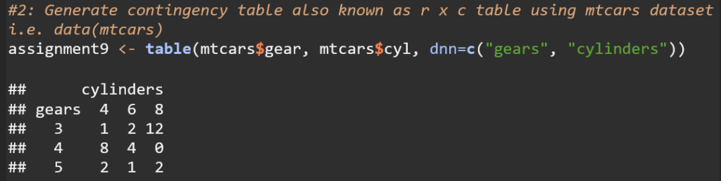
This code creates a contingency table that displays the frequency distribution of the number of cars with different combinations of gears and cylinders in the mtcars dataset.
This code adds a sum row/column that displays the sum of each of the rows and columns.
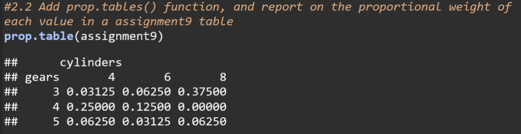
This code converts the frequency distribution table to a proportion table, showing the proportion of each element in regards to the entire dataset. For example, 3% of the cars in the mtcars dataset have 4 cylinders and 3 gears while 37.5% of cars have 8 cylinders and 3 gears.
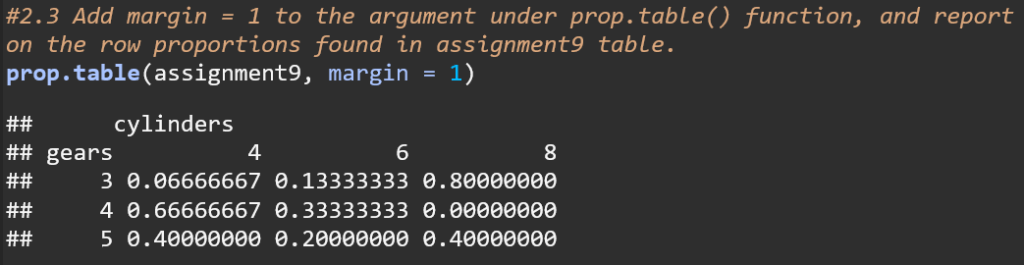
The code uses the argument margin = 1 to calculate row proportions for the assignment9 table. This means that each row’s values are shown as proportions of the total for that row. For instance, in the row for 3 gears, 66.67% of the cars have 4 cylinders, 13.33% have 6 cylinders, and 80% have 8 cylinders. This approach normalizes each row, making the sum of proportions in each row equal to 1.
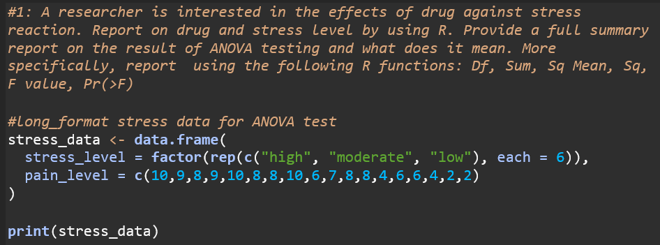
H₀ : The drug has no effect on overall stress across stress levels (stress ratings are equal). H₁ : The drug effects overall stress across stress levels (stress ratings are different)
Stress Df : Degrees of Freedom (Number of Groups – 1): This dataset had 3 groups, so the Df is 2 Residuals Df : Degrees of Freedom (Number of Observations – Number of Groups): This dataset had 3 groups and 18 observations, so the Df is 15
Stress Sum Sq : The amount of total variation that can be explained by the differences in stress levels Residuals Df : Repersents that variation in reaction times that is not explained by the stress levels
Mean Sq : Calculated by dividing the sum of squares by the degrees of freedom. Average measure of variability Stress Mean Sq : Variability explained by Stress level Residuals Mean Sq : Variability within groups that is not explained by Stress Level
F Value : Ratio of Stress Mean Sq to the Residuals Mean Sq. F Value = 21.36 Higher F value means the variability explained by Stress levels is much larger than the variability within groups, which suggests a significant difference between groups
Pr(>F) : Probability of observing an F value as extreme as the one calculated if there were no true differences between stress levels P value is 0.00000408 which is significant less than the typical significance level of 0.05 Low P value provides strong evidence to reject the Null Hypothesis (That there is no variability between stress levels)
The *** symbol: Confirms that the P value is in the highest significant bracket (p <0.001)
Based on the findings of the ANOVA test, the null hypothesis (H₀) can be rejected, indicating that the drug has a significant effect on reported stress across different stress levels. This suggests that the drug influences perceived stress differently depending on the level of stress.
The dataset consists of four groups of infants, each receiving different types of motor stimulation, and records their walking age (in months). The goal of the experiment was to investigate how different levels of stimulation affected the age at which infants begin to walk.
The four groups in the dataset are:
active: Infants who received active exercise.
passive: Infants who received passive exercise.
none: Infants who received no stimulation.
ctr.8w: Infants who received control treatment for 8 weeks.
Based on this dataset:
H₀ : Different Levels of Stimulation do not affect the age at which infants begin to walk. H₁ : Different Levels of Stimulation do affect the age at which infants begin to walk.
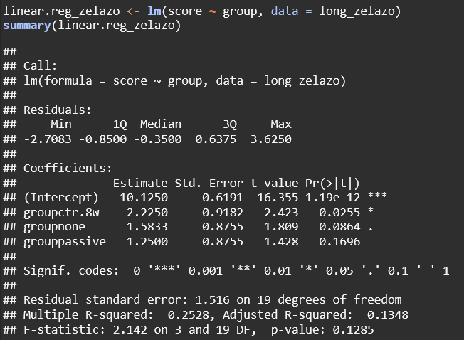
(Intercept) = the average score of the base group
groupctr.8w = The average score of the ctr.8w group is 2.225 points higher than the base group. The p value (0.0255) indicates that this is significant at the 0.05 level
groupnone = the average score of the none group is 1.583 points higher than the base group. The p value (0.0864) indicates that this is not significant at the 0.05 level, but it is significant at the 0.1 level
grouppassive = the average score of the passive group is 1.25 points higher than the base group. The p value (0.1696) indicates that this is not signficant at any level
According to the linear regression model, the ctr.8w group has a significant difference in scores compared to the active group at the 0.05 level. The differences between the none group and the passive groups scores compared to the active group are not significant at the 0.05 level
F-Statistic: This tests if the overall model is statistically significant. The p value of 0.1285 indicates that the overall model is not statistically significant.
The ANOVA test backs up the results of the linear regression model, showing there is not a significant difference between these groups (the p value – 0.129 – is above the significance level of 0.05)
Finally, none of the pairwise comparisons are statistically significant, even after applying the Bonferroni correction.
Based on the linear regression model, ANOVA test, and pairwise t-tests, the null hypothesis cannot be rejected, indicating that the level of stimulation does not have a significant effect on the age at which infants begin to walk.