This week were asked to picked a dataset from the Vincent Arel Bundock dataset list (fantastic resource btw!) and generate 3 visualizations from one of those sets. I decided to use a paired dataset: the Trump_tweets.csv dataset, consisting of 20761 Trump tweets from 2009 – 2017, and its assocated sentiments, sentiment_counts.csv.
Before I could produce my visualizations, I needed to load my libraries, datasets, and tweak the data format a little bit using the following code:
> library(readr)
> library(ggplot2)
> library(tidyverse)
> sentiment <- read_csv("sentiment_counts.csv")

> sentiment <- sentiment %>%
+   mutate(total = Android + iPhone) %>%
+   filter(sentiment != "none")
From there on, I was able to make the following using ggplot2:
TRUMP SENTIMENT COUNTS
ggplot(sentiment, aes(sentiment, total)) +
geom_bar(stat = "identity") +
theme_light() +
labs(x = "Sentiment", y = "Frequency",
title = "Sentiments Expressed by Trump over Twitter (2009 - 2017)")
TRUMP TIMESERIES ANALYSIS — linechart
ggplot(trump, aes(created_at, favorite_count)) +
geom_line(linewidth = 0.5) +
theme_light() +
geom_smooth(method = "lm", color = "tomato") +
labs(x = "Date", y = "Favorites", title = "Trump Tweets Favorite Frequency over the Years (2009 - 2017)")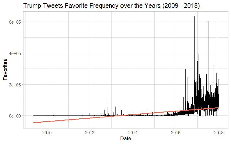
TRUMP TIMESERIES ANALYSIS — Boxplot
ggplot(trump, aes(as.factor(year(created_at)), favorite_count)) +
  geom_boxplot() +
  theme_light()+
  labs(x = "Year", y ="Favorites", title = "Fluctuations of Trump's Tweets Favorites over the Years (2009 - 2018)")
___________________________________________________________________
Personally, I love ggplot2 — It is by far my go to tool for visualization, even when I prefer and use other languages for other tasks. For me, nothing really beats the flexibility I have learned with ggplot2 and I will usually turn to it when given any visualization tasks (Even in my technical writing class where my professor was walking everything through how to make charts in excel, I gave her a whole codebook to support the ggplot visualizations I turned in)
This is to say — I think ggplot is a great package, and I’m grateful for the tools it have given in for not only data visualization, but the customization to make my charts look exactly as I envision them. While the ones I made for this assignment were relatively basic with little customization, I have made incredibly complicated charts using this package before, such as a Sankey diagram I actually got published in a paper, or my final visualization project last semester.
As Always, link to my github: here

Leave a comment